How to Make Your Website User-Friendly
This is a collection of my thoughts on how to improve the usability of your website. I hope you find it useful and usable. I welcome your feedback.
Please email me if you are interested in having me review your website.
Logos
- Place your logo in the upper left-hand corner of all pages.
- Make your logo a link to your homepage.
- Give your logo a hover state.
- << top of page
Place your logo in the upper left-hand corner of all pages.
There are two reasons to do this. First, everyone else is doing it and so users will expect your site to be like everyone else’s. You don’t want people to not know where to find your logo when they’re looking for it. Second, it’s the one part of the page that is most likely to be visible regardless of what size the user’s browser window is.
The one allowable exception to this rule is the homepage. Google’s homepage, for example, has the Google logo in the center of the page but on all other pages the Google logo is in the upper left-hand corner.
Make your logo a link to your homepage.
It’s now commonplace to have the logo be a link to the site’s homepage. I’d say it’s now common enough that it would be a disappointment if your logo did not link to your homepage.
Give your logo a hover state.
If your logo is a link, as it should be, then your logo should have a hover state because all links should have hover states. All links should have hover states because it lets the user know where they are and whether or not they are actually hovering over the item that they think they are hovering over. They are looking at your website and expecting it to behave in such a way that communicates the message “Yes, I’m a link, you can click me!” Don’t make them shift their attention from your website to their mouse pointer (Is it still an arrow or is it now a hand?) in order to find out whether or not something is a link. Tell them with hover states: It’s a link.
(video from July 2009)
Navigation Menus
- In a vertical list of menu items, make sure the blank space to the right of the menu item is part of the link and that the link’s background color changes when you hover over it.
- If you have 2 levels of navigation and the 1st-level menu items sometimes lead to 2nd-level menu items and sometimes don’t, then you should indicate when they will and when they won’t.
- << top of page
In a vertical list of menu items, make sure the blank space to the right of the menu item is part of the link and that the link’s background color changes when you hover over it.
Vertical lists of links should have hover states that include a change in background color for a two reasons: (1) It makes the target bigger, giving the user a larger area to click. This is especially helpful when the text of the link is a very short word, such as “UK”. (2) It also makes the targets a uniform size, which eliminates extra mouse movements when moving down from a long word like “Uzbekistan” to a short word like “UK”.
(video from July 2009)
The reason that the blank space to the right of the text should be part of the link is that if the list contains long words and short words, then the user might be mousing over the list going over the long words and then when they get to a short word, they will have to make an extra mouse movement in towards a short word.
The reason that the blank space to the right of the text should be given a background color for its hover state is that this will make it obvious to the user that they are hovering over part of the link and can click on the space to the right of the word; they don’t have to hover over the word. It also eliminates the dissonance that exists when a user is hovering over one thing (the blank space) and this is causing another thing (the text) to change. If the background color of both the blank space and the text change, then the experience is not disjointed. The user hovers over one thing—the menu item (which includes the text and the space to the right of the text)—and that one thing changes its color.
If you make the blank space to the right of the text part of the link but you don’t change its background color, then the user doesn’t know that they could be mousing over the space to the right of the text. If only the color of the text is changing, then there’s no way for the user to know that they don’t have to be hover over the text.
Perhaps the strongest reason to make the space to the right of the menu item part of the link is that this is what Windows and Mac operating systems do with their dropdown menus, so people are already accustomed to this type of behavior.
A final benefit of making the space to the right of the text part of the link is that it makes the link a bigger target. Some words are very short—like UK for United Kingdom. Clicking on a link that is only 2 letters long can be slightly painstaking. Nothing should be even slightly painstaking.
If you have 2 levels of navigation and the 1st-level menu items sometimes lead to 2nd-level menu items and sometimes don’t, then you should indicate when they will and when they won’t.
On many sites, when I hover over a 1st-level menu item, several 2nd-level menu items will sometimes appear. If your site is like this, and 2nd-level menu items are sometimes going to appear when I hover over a 1st-level menu item, then there should be some indicator of this before I hover over the 1st-level menu item. Otherwise, I will have to wait a half a second to see whether or not any 2nd-level items are going to appear or not. Some sites indicate this with a triangle that points downward (if the navigation goes across the top of the page) and some sites indicate this with a triangle that points to the right (if the navigation goes down the left-hand side of the page).
If all or none of your 1st-level menu items lead to 2nd-level menu items, then you don’t have to worry about this because there is no difference between any of the 1st-level menu items.
(video from July 2009)
Tabs
- Tabs should be connected to their pages.
- The “You Are Here” tab should look more prominent (brighter, taller) than the other tabs.
- Give your tabs hover states.
- The “You could be here” state of a tab and the “You are here” state of a tab should not be exactly the same.
- Make sure the whole tab (not just the text) is part of the link, and have the whole tab (not just the text) change in appearance when it is hovered over.
- << top of page
Tabs should be connected to their pages.
This sounds simple, and it is, but I’ve seen sites that don’t do it right. Tabs on websites should be similar to tabs in real life. They should be connected to the space below them. This means that they should be the same color as what’s below them and there should not be a line that separates them from what’s below them.
Here is an example of what not to do:
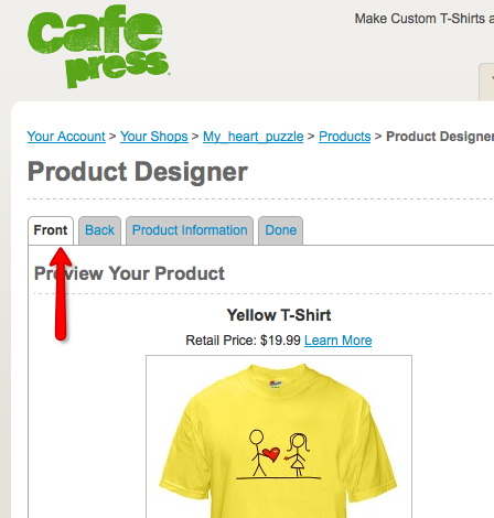
(screenshot from October 2009)
(If you like that T-shirt, you can buy it here.)
The gray line separates the tab from its page, which gives us less of that “You are here” feeling.
This is how it should be:
(screenshot from October 2009)
The tab is connected to the space below it.
The “You Are Here” tab should look more prominent (brighter, taller) than the other tabs.
The tab that the user is currently on should look different, more prominent, than the other tabs. It should be brighter in color and taller in height.
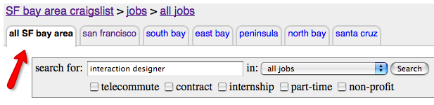
Craigslist’s “You are here” tab is brighter but not taller.
(screenshot from October 2009)
Yahoo! Mail’s “You are here” tab is taller but not brighter.
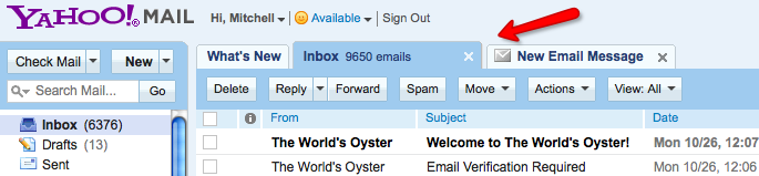
(screenshot from October 2009)
Facebook’s “You are here” tab is brighter and taller but it is not that much taller than the “You are not here” tabs. It would be better if it were even taller.
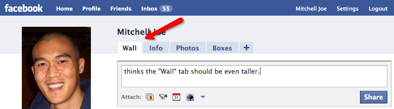
(screenshot from October 2009)
Give your tabs hover states.
Elsewhere, I give reasons why all links should have hover states. Tabs are links, so they should have hover states. That is, when you roll your mouse over a tab that you are not on, it should change its appearance. It should change from the “You are not here” look to the “You could be here (if you click right now)” look.
(video from October 2009)
The “You could be here” state of a tab and the “You are here” state of a tab should not be exactly the same.
There are three states of tabs: “You are here”, “You are not here”, and “You could be here (if you click right now)”. The “You could be here” state is the one that you see when roll your mouse pointer over a “You are not here” tab. These three states are different enough that they should each have their own distinct visual appearance.
On many sites, the “You could be here” state looks exactly the same as the “You are here” state. This is bad. It’s bad because they are two different states and it’s bad because you cannot be in two places at the same time. There should always be only one “You are here” tab. If you were on a page where two different tabs both had the “You are here” appearance, that would be confusing. And this is exactly what happens when the “You could be here” state of the tab looks like the “You are here” state of the tab. It happens only for a split second, but who needs a split second of confusion?
So you should have three different visual appearances for the three different states and, ideally, the “You could be here” state should look like a cross between the “You are here” state and the “You are not here” state. So, for example, if the “You are here” state is white and the “You are not here” state is black, then the “You could be here” state should be gray. The “in between” color nicely reflects the “in between” state of the “You could be here (if you clicked right now)” tab.
One thing that should always be preserved is the line below the “You could be here” tab that separates the tab from the page below it. Some sites (like Wikipedia) do this and it’s bad because it ruins the tab metaphor. Tabs should always be connected to the right pages.
(video from October 2009)
Make sure the whole tab (not just the text) is part of the link, and have the whole tab (not just the text) change in appearance when it is hovered over.
Make sure that the entire tab is part of the link, the words and the space around the words. This preserves the tab metaphor. If you’re (literally) pulling up someone’s dental records, you can grab the part of the file that has their name OR the part that is next to their name but blank. Virtual tabs should be similar to real tabs in this way.
(video from October 2009)
(video from October 2009)
Forms
- Indicate which fields are required with an asterisk.
- Put the “* = required” explanation at the top of the form, not the bottom.
- Align the asterisks on the left (so that they are aligned with each other and are the first thing the user sees).
- Put the cursor in the first field for me.
- Move the cursor to the next field for me if you know I’m done.
- Put the cursor a little bit away from the left side of the input field so that I can see that it’s in the field.
- State the restrictions next to the field. (“Passwords must be at least 6 characters long.”)
- Don’t have unnecessary restrictions.
- Let me know about an error (or that my desired username is already taken) as soon as I try to move to the next field.
- Make my email address my username.
- Dropdown menus should start out blank.
- Make it easy.
- Don’t have a “Cancel” or “Clear Form” button right next to the “Submit” button.
- << top of page
Indicate which fields are required with an asterisk.
If I don’t know which fields are required, then I might try to submit the form without filling in all the required fields. Then when I get the error message that I left some required fields blank, I will mutter to you or to myself, “How was I supposed to know that?” This is an instance of a more general rule. The general rule is: You should always let me know what the rules are. For example, if my needs to be at least 6 characters long, then tell me that before I submit the form.
Put the “* = required” explanation at the top of the form, not the bottom.
The “* = required” explanation should be at the top of the form before I see any other asterisks because otherwise I might see an asterisk, not know what it means, skip it, then get down to the bottom of your form and see that asterisks mean that a field is required, and then have to go back up to the top of the form and make sure I filled out all the fields with asterisks by them. If you put the “* = required” explanation at the top, then this won’t happen because I will know from the beginning what an asterisk means.
Align the asterisks on the left (so that they are aligned with each other and are the first thing the user sees).
Many people who are filling out forms like to do the bare minimum, filling out the required fields but not any other fields. This person will be scanning the form for asterisks. If you put the asterisks on the left, in front of the labels “Name”, “Address”, etc, then it’s much easier to see which fields are required than if you put them after the labels “Name”, “Address”, etc. The most important piece of information for a person like this is the asterisk. If they see an asterisk, then they continue; if they don’t see an asterisk, then they stop. You are wasting this person’s time by making them read through the label of the field to get to the asterisk or lack thereof.
Put the cursor in the first field for me.
This saves me a little bit of time. It saves me the amount of time it takes to move my mouse pointer over to the field and then click on it.
Move the cursor to the next field for me if you know I’m done.
This saves me the amount of time it takes for me to move my mouse pointer over to the next field and then click on it. An example of this is a US phone number. After I enter my area code (which is always a 3-digit number), I should be automatically taken to the next field where I enter the next 3-digit part of my phone number.
Put the cursor a little bit away from the left side of the input field so that I can see that it’s in the field.
If you put the cursor in the first field for me but I can’t see it because it’s too close to the edge, then you might as well not have put it in the first field for me. Here you can see that Google’s cursor is very close to the edge, while MSN’s is a little farther away from the edge. A little farther away from the edge is nicer.
Google’s cursor has 1 pixel of space around it on the left, top, and bottom sides.

MSN’s cursor has 5 pixels of space around it on the left, top, and bottom sides.
State the restrictions next to the field. (“Passwords must be at least 6 characters long.”)
If you have restrictions on what I can enter and don’t tell me, then I won’t know about the restrictions until I press the submit button. If you don’t state your restrictions up front, then this might happen:
You ask me for a password.
I think of my favorite 5-letter word.
I enter it.
I submit the form.
I get an error saying that passwords must be at least 6 characters long.
I think of my favorite 6-letter word.
I enter it.
I submit the form.
That process is much longer than this one:
You ask me for a password that is at least 6 characters long.
I think of my favorite 6-letter word.
I enter it.
I submit the form.
The first process wastes my time.
Don’t have unnecessary restrictions.
Sometimes you see instructions like this: “Passwords must be at least 6 characters long,” and sometimes you see instructions like this: “Passwords must be at least 6 characters long and contain at least one number.” I imagine that forcing the user to include a number as part of their password does make their account more secure. It would be harder for a stranger to guess “potato123” than it would be to guess “potato”. But when you’re making up these restrictions, ask yourself if it’s worth it. If you’re a banking site, then it probably is. If you’re sending out a church newsletter, then it probably isn’t. Just keep in mind that this is less user-friendly because I might have one password that I use for all my accounts that has no numbers in it (“potato”) and then have to create a new one for your site and forget about your extra restriction when I return to your site.
Let me know about an error (or that my desired username is already taken) as soon as I try to move to the next field.
The best time to let me know about an error is right after I try to leave the field. So I love those forms that tell me my username is already taken while I’m still near the username field. Thankfully, these are getting more and more common.
Make my email address my username.
If you’re going to require the person to enter their email address, then I would not ask for a username as well. If your site is big, then they will have a hard time finding a username that isn’t already taken. That can be a frustrating and time-consuming process. And if you’re asking for their email address anyway, then you already have a unique identifier for them.
Dropdown menus should start out blank.
Dropdown menus should start out blank for the same reason that form fields start out blank—you don’t know what the user is going to enter. If they are entering their birthday, then you know that they will choose one of the 12 months but you shouldn’t choose January for them just because that’s what’s first on your list. It’s not very likely that they were born in January. You should add a 13th option that is just a blank space. The 13th line of the dropdown should not say “Month” or “Select month” because the presence of text makes that part of the form it seem filled out when it’s not; they still have to select their month.
Make it easy.
When I’m entering the expiration date of my credit card to buy something online, I look down at my credit card and it says something like “Valid Through 08/12”. The “08” is the month and the “12” is the last two digits of the year, 2012. Then when I look on the online form that I’m filling out, it often has a dropdown with all the months and another dropdown with the years. The problem is that the month dropdown often lists the months by name while my credit card describes the month as a number, and so I have to spend a little bit of time figuring out whether “08” is July or August. It’s true that it’s only a very little amount of time, but however quickly you can figure out that “08” is August, I bet that you can figure out that “08” is “08” even more quickly.
Universe, let it be known that Mitch thinks that the month dropdown of the credit card expiration date should come with numbers. It should either be only numbers or it should be numbers with the names of the months next to them, but it shouldn’t be only the names of the months. It should probably be only numbers. After all, what do you need the name for?
Don’t have a “Cancel” or “Clear Form” button right next to the “Submit” button.
On some forms I see a “Cancel” or “Clear Form” button right next to the “Submit” button. This more or less completely boggles my mind. Why on earth would you have a button like that there? Everyone knows where the delete button is. What are the chances that I’ve filled out this form and when I get to the bottom, I want to clear everything that I’ve just entered? And what are the chances that I fill out this form, get to the bottom and try to submit but accidentally hit this “Clear Form” button that’s right next to the “Submit” button?
Text
- Avoid writing in all capital letters.
- Avoid writing in italics.
- Use an adequately large font size.
- Spell and punctuate correctly.
- << top of page
Avoid writing in all capital letters.
Sentences written in all capitals are harder to read because all the letters are the same height. If you use lower case letters, then your readers can cheat a little bit. If they glance at a tall letter like b, then they know that it’s not a short letter like a or c. But if you write in all caps, then A and C are the same height as B. The reader can no longer glance at a B and know that it’s not an A or a C from its height. The reader will have to pay more attention to which letters are which.
Avoid writing in italics.
Italicized text is harder to read than non-italicized text and so it should be avoided although or used very sparingly.
Use an adequately large font size.
The smaller your font size is, the harder it will be to read. I would recommend using a font size of at least 13 point.
Spell and punctuate correctly.
Misspelled words are harder to read than correctly spelled words. They are jarring and, like speed bumps, they slow you down. They also show that you haven’t paid attention to the details. Same goes for grammatical mistakes. If you’re not paying attention to your words, then maybe you’re also not paying attention to my merchandise, my privacy, or something else that’s important to me.
I once read a resume that said, “I am technically savy.” What sunk in was not her claim to be technically savvy; it was the fact that she couldn’t spell, or at least couldn’t catch her spelling mistakes.
Writing
- Say what you mean.
- Use everyday words.
- Be concise.
- Show OR Tell.
- Convey your message as quickly as possible.
- << top of page
Say what you mean.
If you say that I’m searching “All Mail”, then I am going to believe that I am searching ALL of my mail. I will not think that I’m searching all of my mail except the spam folder, because that’s not what you said. So please, say what you mean. If you mean all mail, then say “All Mail”. If you mean all mail except the spam folder, then say “All Mail Except Spam”. Otherwise, I will believe that a message is not there when in fact it is there.
Robert Louis Stevenson advised, “Don't write merely to be understood. Write so that you cannot possibly be misunderstood.”
(video from October 2009)
Use everyday words.
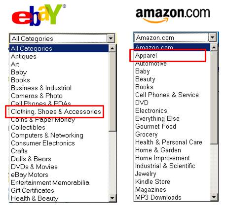
If they saw a naked man running across a football field, normal people (I think I can speak on behalf of normal people) would say, “He’s not wearing any clothes!” rather than “He’s not wearing any apparel!” There is a time and a place to use non-everyday language like ‘apparel’ but most websites are not those places. Most websites are everyday places and most people visiting these websites are everyday people, so you should stick to using everyday words like ‘clothes’ rather than ‘apparel’. One reason to do this, besides the fact that your users won’t have to do a quick little silent translation (“Apparel—that’s clothes.”), is that when everyday people want to buy clothes, they are going to look for it under ‘clothes’, not ‘apparel’.
Be concise.
For good reason, the following advice is often quoted:
Vigorous writing is concise. A sentence should contain no unnecessary words, a paragraph no unnecessary sentences, for the same reason that a drawing should have no unnecessary lines and a machine no unnecessary parts. This requires not that the writer make all his sentences short, or that he avoid all detail and treat his subjects only in outline, but that every word tell.
—William Strunk Jr.
in Elements of Style
I can’t say it any better than that. I recommend looking at your site and asking of every single word: “Is that word necessary to my users?”
Show OR Tell.
Here are some extra words on one of Google’s pages:
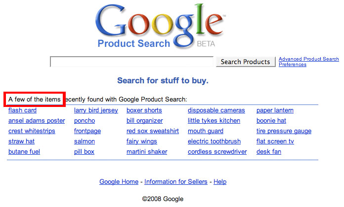
The phrase they use is “A few of the items recently found with Google Product Search:” but they don’t need the words “A few of the items” because I can see that those things are items and that there are a few of them. Without the words “A few of the items” the page is just as effective:
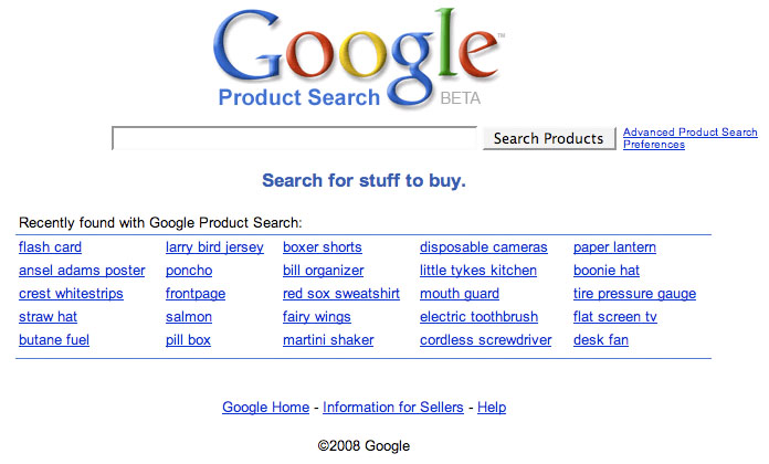
Ask, of every word, “Is that word necessary to my users?”.
Convey your message as quickly as possible.
For whatever reason, your users are in a hurry. Whatever you write, they want to stop reading it as soon as possible. Subconsciously, they are constantly asking themselves, “When can I stop reading this?” And the answer is, “As soon as it stops being relevant, helpful, or useful.” Users are impatient, so it is the job of the web writer to convey as quickly as possible what a certain sentence or a certain paragraph or a certain section of a website is about.
Consider these two sentences, which express the same thing:
You must sign up for the newsletter if you would like to receive the coupons.
If you would like to receive the coupons, then you must sign up for the newsletter.
Now consider the two types of people: the people who want coupons and the people who don’t. If you write a sentence like the first one, then both types of people must read the whole sentence. After reading the first half of the sentence, “You must sign up for the newsletter if�”, I have to keep reading because I don’t know what comes after the ‘if’. Now consider the second sentence. After reading only half of the second sentence, “If you would like to receive the coupons,” I can stop reading and go on with my life if I don’t want coupons, or I can continue to read this sentence if I do want coupons. It lets me choose my path of action sooner by offering me the choice earlier.
Links
- If you’re a link, then look like a link.
- Give your links hover states.
- If you have a picture coupled with text and the picture and the text are going to the same place, then give them one hover state.
- Say what you mean. Link what you mean.
- Put action links at the end of a sentence.
- Make the destination of the link clear.
- << top of page
If you’re a link, then look like a link.
If your liquor store looks like a hair salon, then you’re not going to sell much booze. That’s because if your store looks like a hair salon, then people will think your store is a hair salon, because most things that look like hair salons are hair salons. If your links don’t look like links, then how will people know that they can click on them? If they don’t know that they can click on them, then they probably won’t click on them. Just like if your hair salon looks like a liquor store, then you’re not going to get many people walking in and asking for a haircut. So make sure your links have a sufficiently different appearance from your non-links.
Give your links hover states.
All links should have hover states because hover states do two things: (1) They let the user know that the thing that they are hovering over is in fact a link (and not plain text), and (2) They give the user confirmation that they are indeed hovering over what they believe they are hovering over. This prevents the user from clicking on the wrong link.
If you have a picture coupled with text and the picture and the text are going to the same place, then give them one hover state.
If two items have two different hover states, then they seem like they link to two different places. If they are going to the same place, then they should have one joint hover state.
(video from October 2009)
Say what you mean. Link what you mean.
If your link says “motorcycles”, then it should take me to a page about motorcycles.
Here is an example of making a link out of the wrong words, from Bank of America’s website:
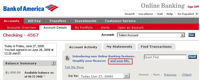
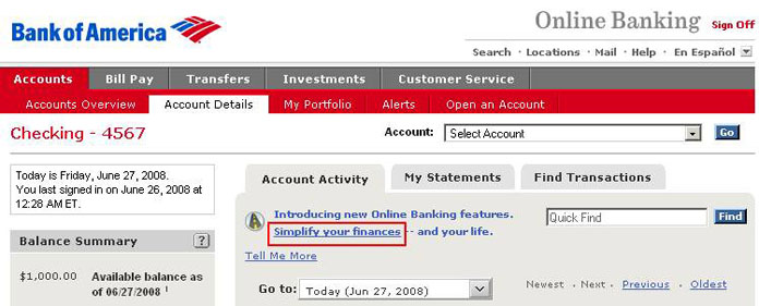
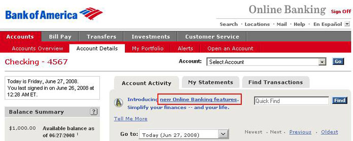
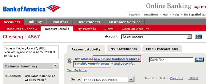
The text is: “Introducing new Online Banking features. Simplify your finances – and your life,” and they have chosen to make a link out of the words “and your life.” This seems like a bad choice because just as a link whose text is “and your life” should take you to the And Your Life page. I don’t know what the And Your Life page would be. This means that I have to guess where it will take me and I should never have to guess where a link will take me. If this is the text: “Introducing new Online Banking features. Simplify your finances – and your life,” then the acceptable phrases to make links out of are “new Online Banking features” and/or “Simplify your finances”. It’s probably also okay to make a link out of “Simplify your finances – and your life,” although that kind of gives me the impression that I will be able to simplify parts of my life that are not financial and I’m pretty sure that that is not what they mean. So it should look like this:
Or this:
Or this:
Here is another example of not linking what you mean, which I found on Amazon:

At the top of Amazon’s homepage, it says “Hello. Sign in to get personalized recommendations.” This is bad because if you click on the “personalized recommendations” link, it doesn’t take you to a Personalized Recommendations page—it takes you to the Sign In page. Since it takes you to the Sign In page, the words of the link should be “sign in”. It should be something like this: “Sign in to get personalized recommendations.”

But action links seem more comfortable when placed at the end of a sentence, so it should look like this: “To get personalized recommendations, sign in.”
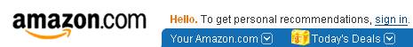
or this: “For personalized recommendations, sign in.”

or this: “Want personalized recommendations? Sign in.”
Any of those would be clearer. If your link says “personalized recommendations”, then it should take you to personalized recommendations, not to a Sign In page. If you’re going to take someone to the Sign In page, then the words of the link that takes them there should be “Sign In”.
Put action links at the end of a sentence.
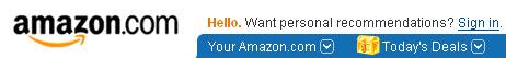
Links that are actions should be placed at the end of the sentence so that the user knows what they’re getting into by clicking on the link. Here is a part of amazon.com:
Because the "personalized recommendations" link takes you to the sign in page, I think that they should have made a link out of the words "sign in". Now, if they had done that, then their sentence would have looked like this:
Sign in to get personalized recommendations.
And a better version of this sentence would be this:
To get personalized recommendations, sign in.
As I read the first sentence, I have no idea why I might want to sign in while I am reading the link. But in the second sentence, I know exactly what’s being offered to me by the time I am presented with the link. The difference between putting the link at the end of the sentence and putting it somewhere else is like the difference between a waiter offering you the dessert menu when you’ve finished your meal and offering it to you while you’re still eating your appetizers. One makes sense; the other doesn’t.
Make the destination of the link clear.
Links should always be worded so that the user knows exactly where they will be taken if they click the link. There should be no surprises. The user should not find themselves thinking, “Oh, it takes me here. I thought it was going to take me over there.” They also should not find themselves unable to predict where a link will take them and upon arriving say to themselves, “Oh, so this is where it takes me.” The destinations of all links should be perfectly predictable.
FAQ
- On your FAQ page (or any page that has links that take the user farther down the same page), make sure that your links are actually going to the right place on the page.
- << top of page
On your FAQ page (or any page that has links that take the user farther down the same page), make sure that your links are actually going to the right place on the page.
On pages where links take the user farther down on the same page (such as a Frequently Asked Questions page), the topic that the user clicked on should appear at the top of the browser window. To ensure that this happens, you need to make sure that the page is long enough. If it’s not long enough, then the user will not be taken directly to the subject that they’re interested in, and will be confused for at least a moment.
(video from July 2009)