
Mitchell Joe, Ph.D.
UX Researcher and Designer

Case Study that Shows My Research Process
Background of this Research
This is a story about how my UX research efforts improved the UX design at Chartboost, a games-only mobile ad network. I was hired as the first and only UX researcher at Chartboost. Chartboost’s primary users are game developers who want to either: (1) make money by showing ads on their games or (2) spend money on advertising in order to acquire new players for their games.
Product: Targeted Ads
Game developers can choose which audience sees their ad. For example, they might want to show it to people who have played their game but have not gotten past Level 1 yet, or to people who are between Levels 5 and 10 but have not made a purchase yet. Things like that.
Problem: Targeting capabilities and behavior are hard to explain to users
Due to a technical constraint, the short-term design needed to use audience targets that were not fully flexible. What it boiled down to was this: If you wanted to target these 2 groups:
- People who have played Game 1 within the past week and are above Level 1
- People who have played Game 2 within the past week and are above Level 1
then there was a danger that you would end up targeting this single group:
- People who have done BOTH of these things:
- played Game 1 within the past week and are above Level 1 AND
- played Game 2 within the past week and are above Level 1
And those targeting choices are not the same.
To explain it using Venn diagrams, the problem was that people might think they were targeting these 2 shaded areas:
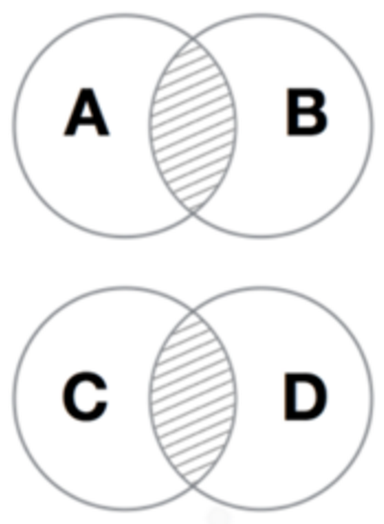
but what they’d really be targeting is this 1 shaded area:
To explain it using cool and refreshing soft drinks, the problem was that people would be asking for this:
Iced Tea and Lemonade

but what they’d be given is this:
Iced Tea and Lemonade

That was the problem.
The Design
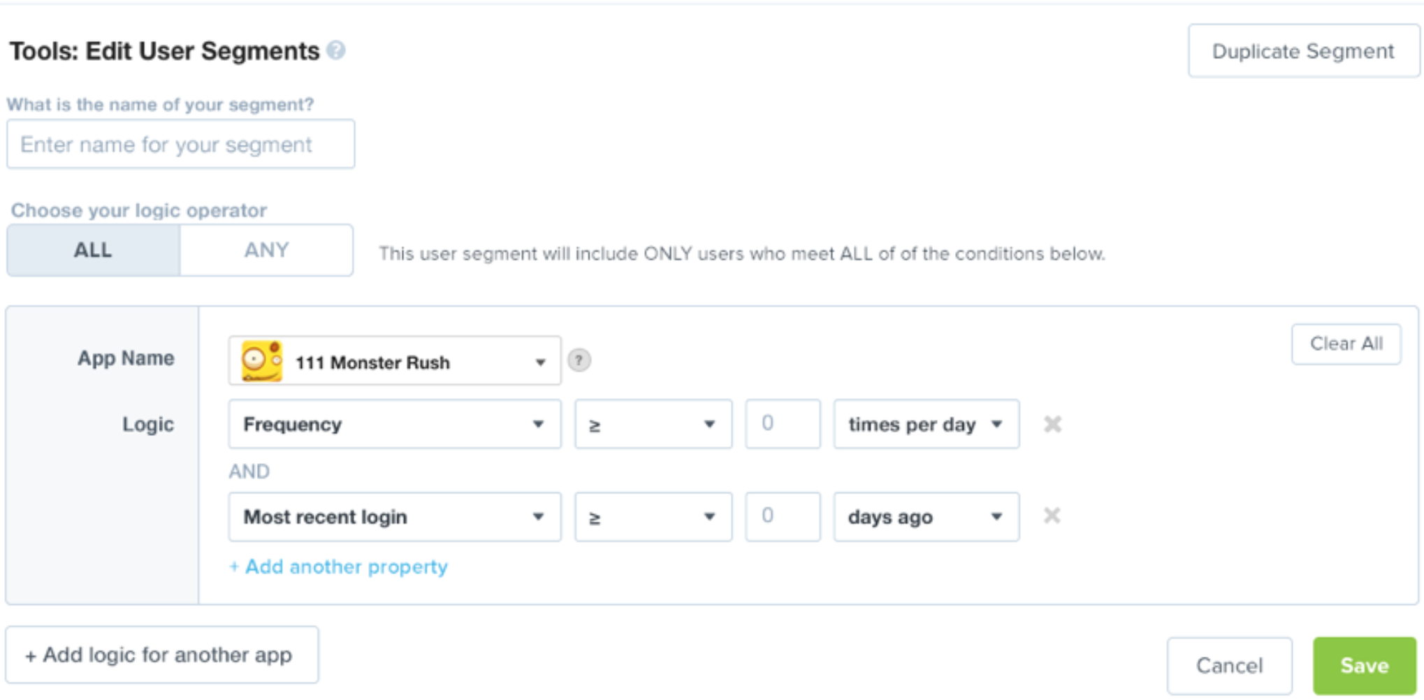
Without a researcher, this is the design that would have been built and pushed live (after color was added).
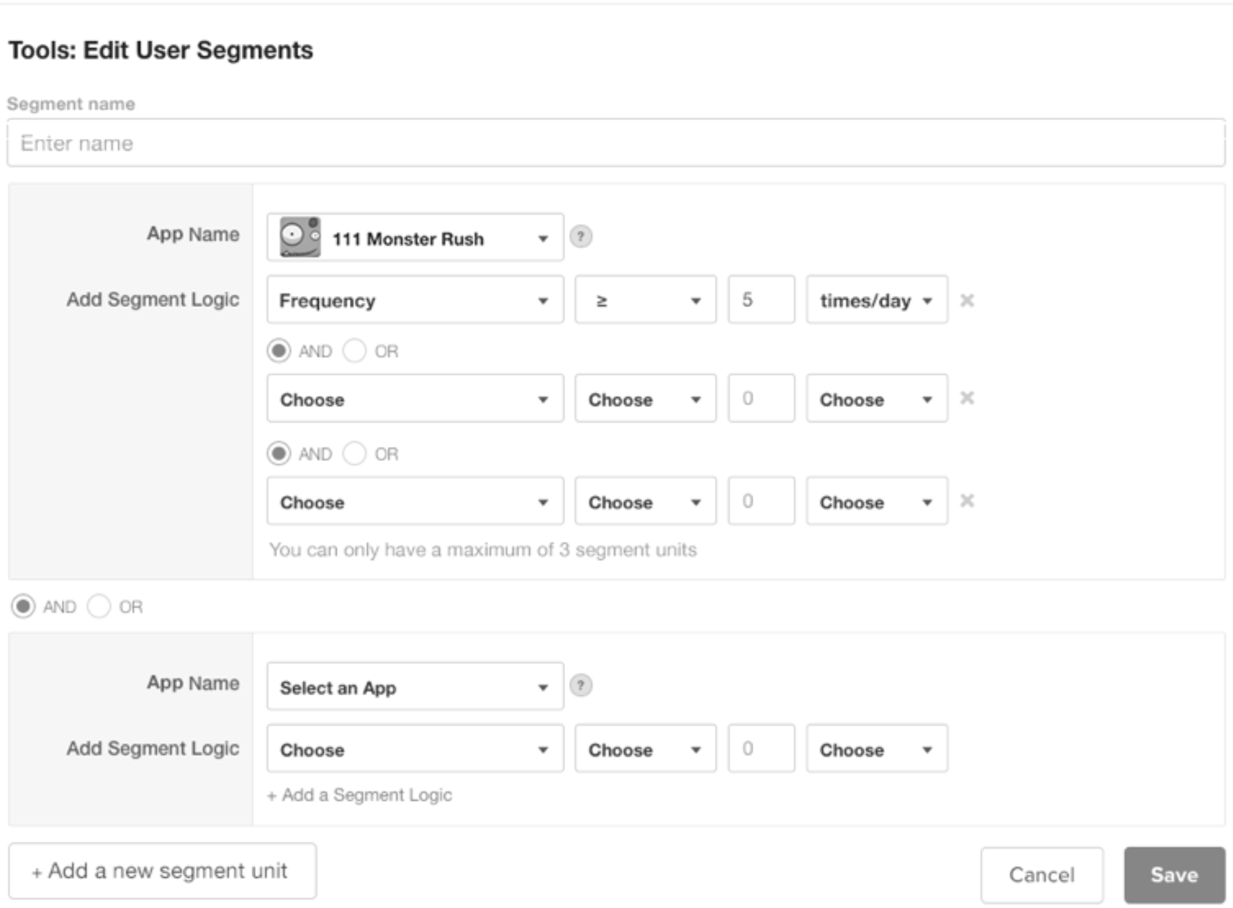
It would have failed. I tested this design with users and I encountered the problem we feared: People did not understand what they were targeting with this UI.
The 2 levels of AND/OR choice (shown above) misled and confused people.
In the next design, the design team moved the AND/OR choice to the top so that it would be clearer that the logical operator that was chosen could be chosen only once and would apply to all of the criteria that were chosen.
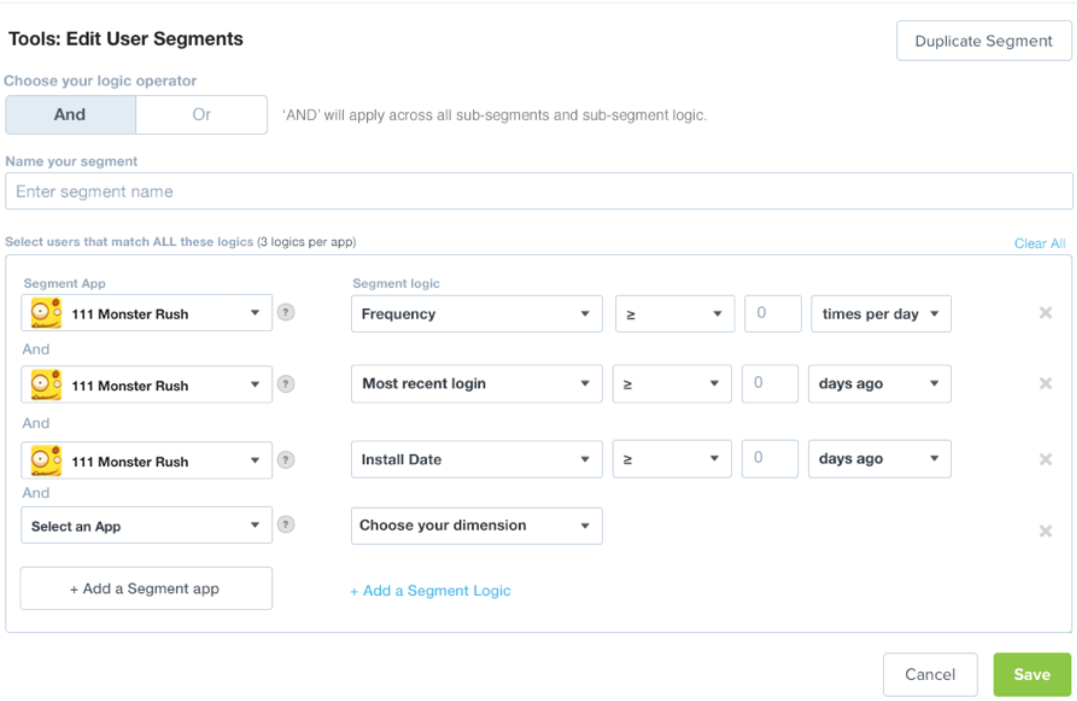
But it was quickly evident that when people create target audiences for their ads, they don’t expect their first task to be “Choose a logical operator.” There were also several issues around the language of the UI that gave users problems.
In the next iteration of the design, we moved away from the wording of “ANY/OR” and went with “ALL/ANY” instead, which I had noticed in a competitor’s product. This was much clearer to users. But I still felt that it could be even clearer.
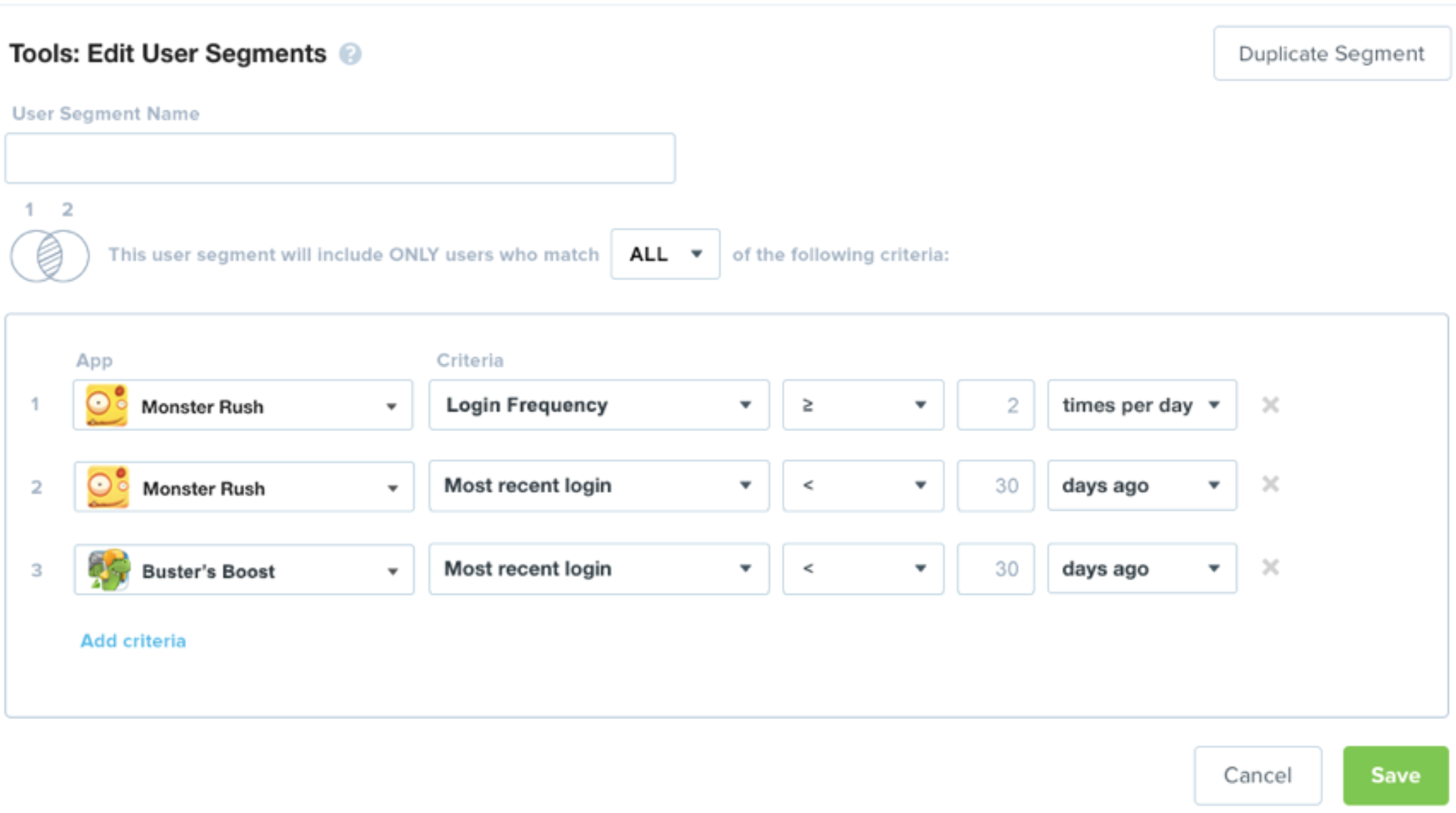
As I was introducing the problem to a designer who had just started to work on the project, I found myself drawing Venn diagrams on a whiteboard to explain it to her. As I was doing this, I thought, “This is how we should explain it to users, too. This is an easy way to understand whether you’re making your target wider or narrower as you add more criteria.” So the final design included a small Venn diagram that changed depending on the user’s choice of “ALL/ANY”. Users understood what was going on most quickly in versions that included the Venn diagram graphic (as opposed to text only).
These text-only versions were understood but not very quickly.


When we added the Venn diagram graphic that changed with the dropdown menu choice, these were understood much more quickly.


To go back to the beginning, this is what it would have looked like without any research:
And here is the final design result, what we arrived at after 3 rounds of testing different versions with users:
After we arrived at the final design, the engineers built it, and there was peace throughout the land.